ESSENTIALS page 1 with graphs S1 to S6
|
Real example |
Simulation of ideal loudspeaker/room |
 |
|
| Page 1, informations on measured system and SPL levels in dB weighted B and C
Performance values are given between 0 and 10, higher is better, also read FAQ :
You cannot directly compare above values to those found in the AudioScienceReview website, we show values computed from real measurements while in ASR, the values are calculated in a different way and from an estimation. |
|
 |
 |
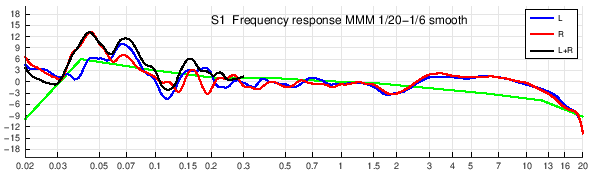
| S1 Frequency response is smoothed to 1/20th octave under 200Hz and 1/6th above 200Hz and represents the global balance of the loudspeakers measured with MMM method. Black curve corresponds to L+R at low frequencies. Green curve is the personnalised target computed with measurement results, room volume, listening distance and speakers directivity. Important note : those responses are displayed with Spectral Envelopes smoothing not with the standard fraction of octave smoothing. Spectral envelope is considered as a better representation of perception and differences are generally seen with less pronounced dips. | |
 |
 |
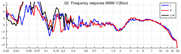
| S2 This response is more detailed because it is smoothed at 1/20th octave on the whole spectrum and with a scale nearer to CTA-2034 recommandations (25dB for a frequency decade). | |
 |
 |
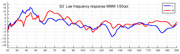
| S3 Blue curve (left) and red (right) represent low frequeny response under 200Hz. Here we can see room modes near 35, 60 and 100Hz. Those modes may be corrected by EQ, parametric or FIR, but dips at 55 et 70Hz will be difficult to fill. | |
 |
 |
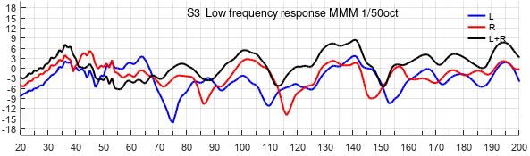
| S3 Comparison of in-phase L+R and L and R : normally L+R should be higher than L and R . But here between 40 and 70Hz, L+R is lower. This can lead to missing low frequencies while listening because those frequencies are generally recorded in mono (L+R). | |
 |
|
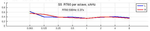
| S5 RT60 is representing reverberation time in seconds. This measurement is not done in conformity to RT acoustics standard but gives a good indication of the energy decrease per frequency band. It is better that the curve shows no increase to the right (higher frequencies). | |
 |
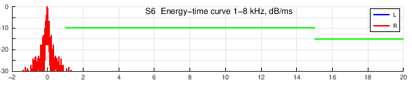 |
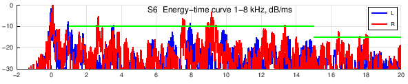
| S6 ETC Energy Time Curve shows the first 20 milliseconds, to display early reflections. It is recommended that both L and R curves stay under the recommanded AES limits in green. Here we see reflections at 3, 8 and 9ms. | |
| Page 2 Temporal aspects and phase, graphs S7 to S12 | |
 |
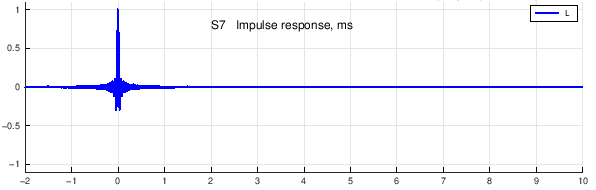 |
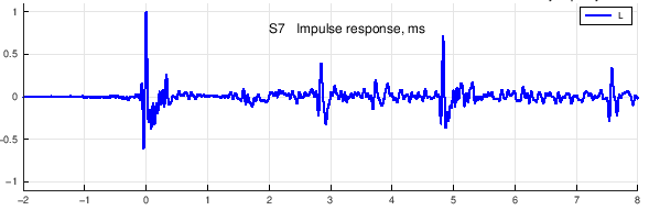
| S7 and S8 show impulse responses. In an impulse response, it is mostly the high frequencies that are visible. In this graph, we see a reflection at 4.8ms which correspond to a diffrence of distance of about 1.6m (4.8×0.34m). | |
 |
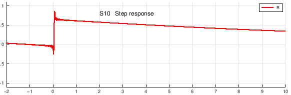 |
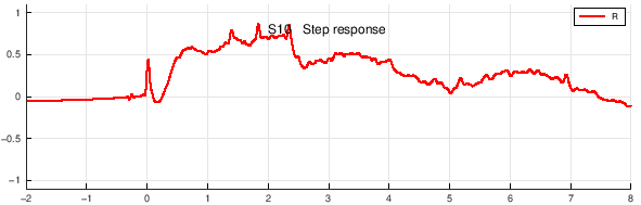
| S9 et S10 the step response is totally equivalent to impulse response, but with energy better dispatched on the frequency spectrum, it better shows the whole spectrum and it is easier to see some informations : here we see high frequencies starting before mids and lows (typical of a standard crossover). | |
 |
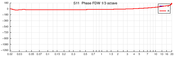 |
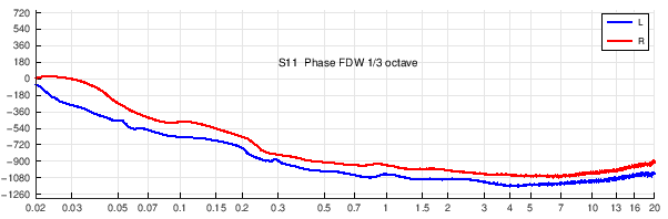
| S11 Phase : measurement being done at listening position, phase is retrieved from a frequency dependant window. The ideal response should be flat but we know that phase response is less important than amplitude. | |
 |
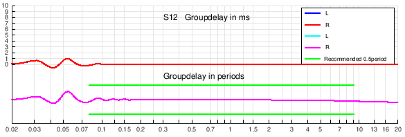 |
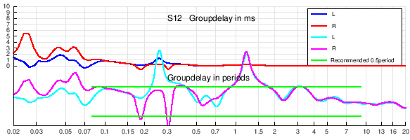
| S12 Group delay corresponds to phase variations : there is no clear limit of audibility but a response between the two green lines should be ok, it corresponds to +-0.5 periods. In above example, we se a peak at 1.2kHz due to the crossover. | |
| Page 3 Other temporals, localisation and distortion, graphs S13 to S18 | |
 |
|
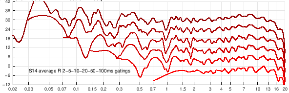
| S13 et S14 Temporal evolution of frequency response : the time window starts at 2ms up to 100ms so we can see the arriving and evolution of some reflections. | |
 |
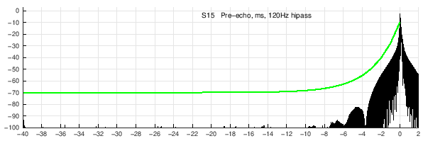 |
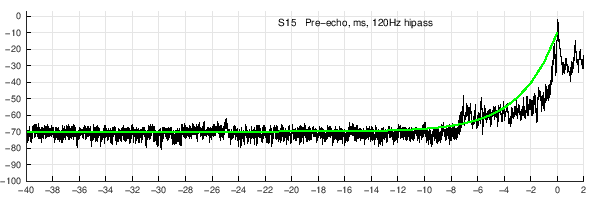
| S15 Pre-echo is a signal starting before the real signal (0ms) that may come from FIR equalisation : here some pre-echo can be seen near -7ms at -60dB. Green curve is a crude estimation for an audible limit. | |
 |
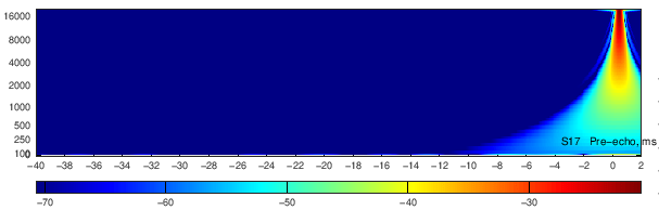 |
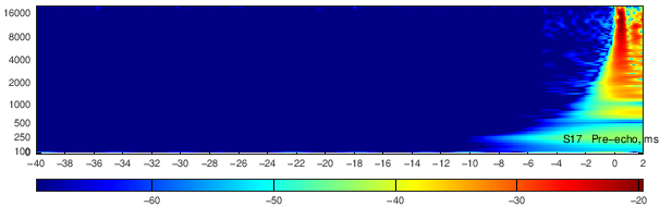
| S17 With wavelet display, we can see the spectrum of the pre-echo signal. | |
 |
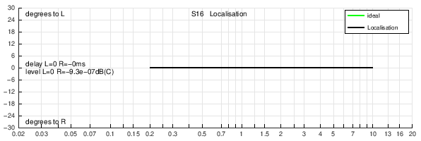 |
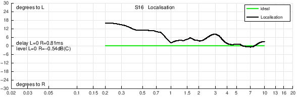
| S16 Localisation : a well centered soundfield should stay near the green line for all frequencies but it depends on LR balance and loudspeakers distances. In this example, we see a progressive shift to Left in low frequencies. ITD Interaural Time Difference and ILD Interaural level Difference are indicated on the graph. | |
 |
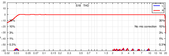 |
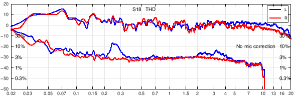
| S18 Total Harmonic Distortion (THD) : due to the short length of test signal sweeps, and depending on noise in the recording, distortion graphs may not allways be representative of the true distortion of measured loudspeakers. In this case, a measurement with stepped sine wave would be more effective (use REW or similar softwares). | |
| Page 4, other temporals, graphs S19 to S24 | |
 |
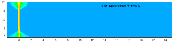 |
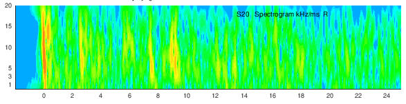
| S19 and S20 Spectrogram : this view is similar to S7 but detailled in frequencies : here are some reflections at 3, 8 and 9ms. | |
 |
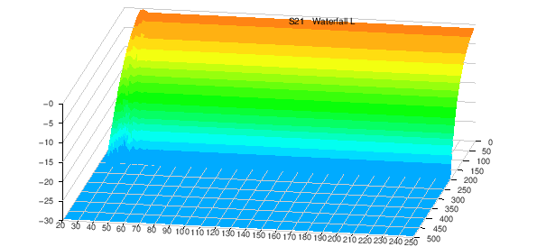 |
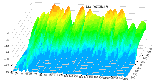
| S21 et S22 Waterfall may give indication of room modes in low frequencies. In this case, a mode is seen at 40Hz. | |
 |
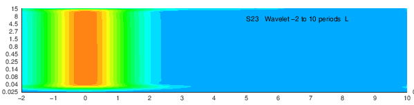 |
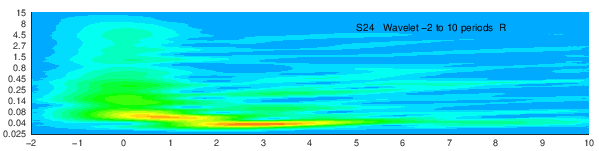
| S23 et S24 Wavelet visualisation Comparable to spectrogram S13 but this kind of analysis gives better resolution in low frequencies. Note that the horizontal scale is in periods. The 40Hz mode is clear. It is interesting to know that resonnant modes stay horizontal but reflexions are seen as oblique lines going up to the right. |
|
| Graphs p5 for temporal alignement | |
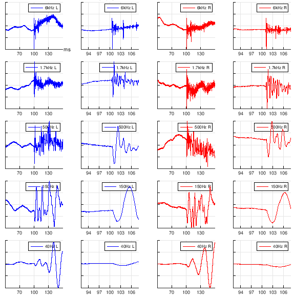 |
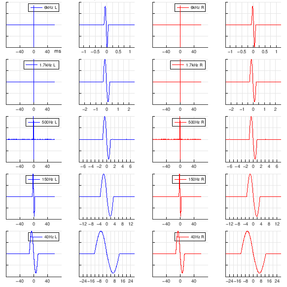 The perfect temporal alignement is when all crossings to level zero are at time 0 for all frequencies. The perfect temporal alignement is when all crossings to level zero are at time 0 for all frequencies. |